Drawing on kraft paper: a beginner’s guide to toned sketchbooks
Published · 4 min read
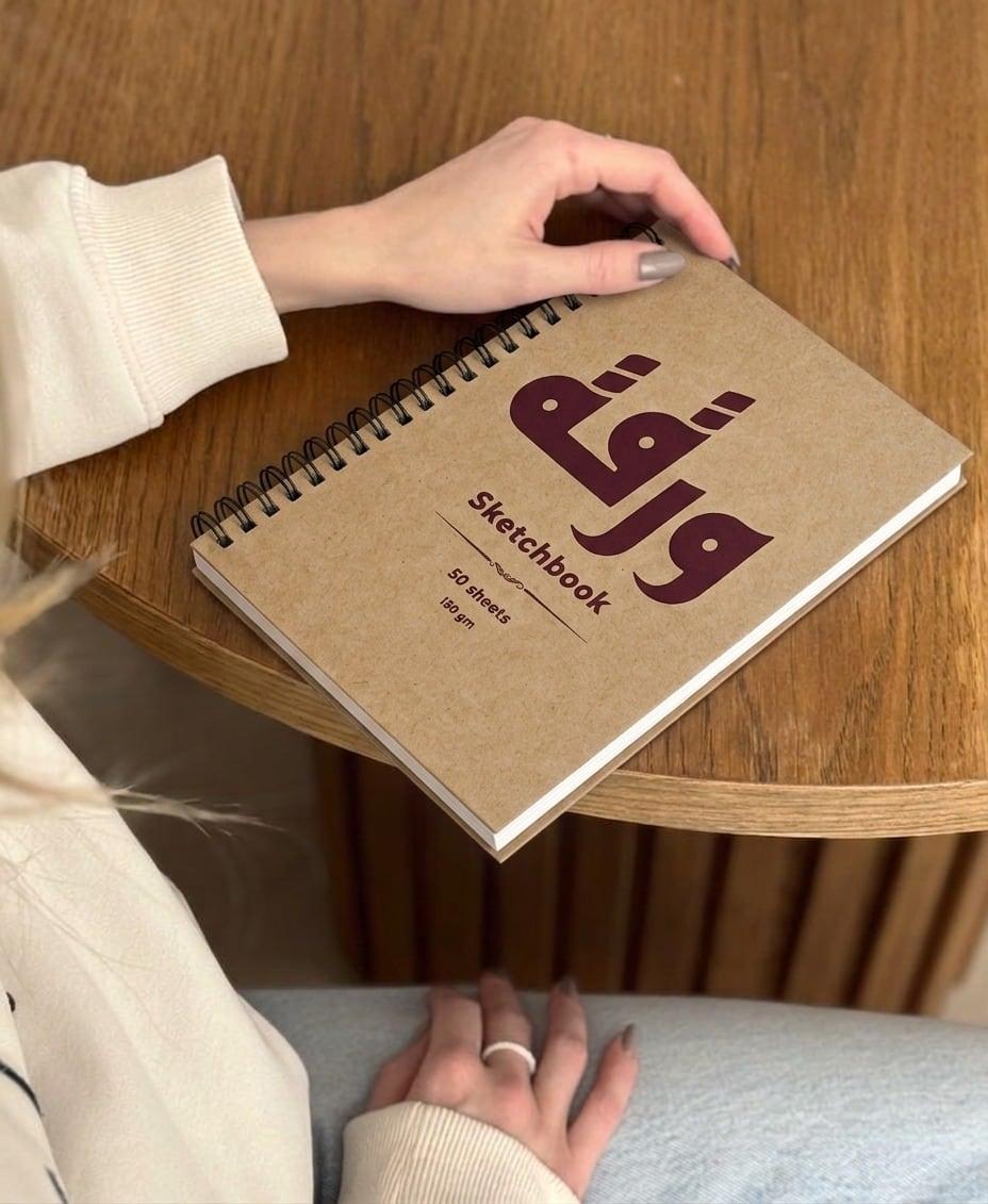
On a mid-tone page you only draw half the drawing: the shadows go down in graphite, the light goes up in white.
A white page asks you to build every value from scratch. A kraft page already gives you the middle. That single change makes drawing faster, more dramatic and, for many people, much less intimidating.
Why toned paper works
Kraft is a warm brown mid-tone. When you draw on it, the paper itself becomes the half-tone: you add darks for shadows and lights for highlights, and leave the rest alone. Portraits, still lifes and figure studies pick up depth in a few strokes.
What to draw with
- Graphite pencil or charcoal for the shadows.
- White charcoal, white pastel pencil or a white gel pen for the highlights.
- Brown, sepia or sanguine pencils sit naturally on kraft for warm studies.
- Black fineliner for crisp line work; the brown paper makes it feel softer than on white.
A simple three-value method
- Sketch the outline lightly in graphite.
- Block in the shadow shapes, nothing else.
- Add white only where the light hits hardest. Stop earlier than you think.
That last step is where kraft shines: a little white reads as bright light because everything around it is mid-tone. Use too much and the effect disappears.
Paper weight for kraft
Toned dry media don’t need heavy paper. Around 180gsm gives enough tooth for charcoal and pastel and stays comfortable for gel pens. Avoid heavy washes on kraft; it is a dry-media paper.
Try it on something everyday: a tea glass by the window, a hand, the folds of a curtain. Toned paper makes ordinary light look special.